

NYC OpenData is a website that houses over 1,400 data sets from more than eighty New York City agencies and offices. The Mayor’s Office of Data Analytics (MODA), who is responsible for NYC OpenData, makes these data sets freely available to the public in order to augment government transparency and accountability. NYC OpenData also provides tools for data manipulation and visualization in the form of charts, graphs, and interactive maps. Citing low usage, MODA engaged our team to conduct a usability study of the website.
Challenge: Improve engagement and usability of the NYC OpenData website, specifically for MODA’s target user group (users with average technical abilities).
My Role: UX researcher. I worked with a team of three other UX researchers to produce a study on how MODA could improve user interactions with the NYC OpenData website.
Project’s Impact: The NYC OpenData website was given a complete redesign, which incorporated three of our recommended changes; these changes significantly improved usability for MODA’s target user group (based on user tests conducted following the redesign).

We began by conducting (1)RESEARCH in order to fully understand the problems users were having with the website. For this research, we elected to perform user tests because MODA’s primary interest was in learning how actual users interact with the website, and user tests are the most effective means for collecting this type of data. Our research was subsequently analyzed during the (2)SYNTHESIZE stage of our study, and our findings were then used to (3)IDEATE recommendations that could provide remedies. Finally, we sought to (4)VALIDATE our recommendations by soliciting feedback from the client and testing their efficacy by conducting a final round of user tests on the website, post-implementation.


Michael Sedillo of MODA
In order to ensure the focus of our usability study aligned with the needs of the client, our team held an in-person meeting with Michael Sedillo, a representative from MODA. During this meeting, we learned that MODA's primary goal for the website was that it allow users with average, as opposed to advanced, technical skills, the ability to find and interact with interesting and compelling data sets. Following this meeting, our team developed a user profile for who we would approach to take part in the usability study. We determined that our only requirement for participants would be familiarity with technology and web searching (other demographic limiters such as age, gender, income, etc. would be unnecessary provided MODA's focus on users with average technical skills).

Following the meeting with Mr. Sedillo, our team met to collectively explore the website in order to better understand its content, structure, and features. A considerable amount of time was spent analyzing the homepage, as it would be the first page most visitors to the website would encounter (Fig.1). We noted that the homepage had no introduction or primer addressing the purpose of the website and that in order to access the website’s available data sets, a visitor would need to either perform a textual search or browse by category. We also observed that a considerable amount of visual real estate was dedicated to presenting data visualization projects that utilized the website’s data sets.
After the exploratory stage of our team meeting was complete, we next discussed the kinds of user tests we would like to administer and the types of participants we would like to recruit in order to better understand how individuals from our target user group (i.e., users with average technical skills) would interact with the website and how they’d feel about their experiences. We all agreed in-person, moderated user tests were a must, but in order to gather a sufficiently diverse body of data, we felt remote, unmoderated user tests should be employed as well, as they could be performed by participants outside the immediate New York metropolitan area.

We next began the process of defining the tasks for our user tests and completing the documentation necessary to support them. This documentation included participant consent forms, moderator scripts, and post-test questionnaires. Modified versions of these documents were subsequently produced that could be used for our remote, unmoderated user tests. With our tasks defined and our documentation complete, we then enlisted a group of fellow UX researchers to act as participants in our pilot user tests, which we ran in order to find any unforeseen issues that might arise during the course of our actual user tests.

Our study consisted of sixteen participants. Four participants completed in-person moderated user tests (captured via Lookback software). The other twelve participants performed remote unmoderated user tests (conducted via UserTesting.com). While the demographic makeup of these participants (i.e., gender, age, income, and location) varied, their level of technical acumen (i.e., average) was consistent throughout. MODA’s primary interest in making the website attractive and easy to use for individuals with average technical skills drove our team’s decision to require that participants be these types of users.
Moderated (In-Person) USER Tests
A brief pre-test questionnaire was administered in order to capture basic demographic information about the participants, as well as their familiarity with the concept of open data and their attitude regarding a government’s responsibility to make its data freely available.
Before beginning the user test, participants were asked to view the homepage without clicking on, or navigating away from it. They were then asked to answer the following questions:
“Based on what’s presented on the homepage, what would you expect to find throughout the rest of the website?”
“Who do you feel this website was designed for?”
“Who do you think currently uses the website?”
Next, participants were asked to complete two targeted tasks. In designing these tasks, our team sought to make use of various aspects of the website, including its search functions, filters, and visualization tools.
Task 1: “You are thinking of moving to a new apartment in Bay Ridge, Brooklyn. Before you sign the lease, however, you’d like to learn more about the school that your third grade child will be attending. You know that the NYC School District for Bay Ridge is District 20. You also know that the address of your new apartment dictates that your child would attend the Vincent D. Grippo (P.S. 69) school. Using the tools provided by NYC OpenData, find the school’s average third grade class size and the school-wide student-to-teacher ratio.”
Task 2: “You work for an organization that is about to launch a campaign to reduce water consumption in NYC. As part of a baseline study, you’re interested in finding data about historical water consumption in the city and you want to present this information in a graph. Using this data set, create a line graph to illustrate NYC’s per capita water consumption, with years being presented in ascending order along the X axis, and with the Y axis beginning at zero. Once you have the graph the way you want it, save it with a filename of your choosing.”
After performing these two tasks, participants were then asked to rate the task’s difficulty on a scale of 1 to 5 and give brief feedback as to why they chose the given score. Next, they were instructed to navigate back to the homepage and explore a data set of their choosing in order to determine which data manipulation and/or data visualization tools were available to them.
Finally, participants were asked to complete a post-test questionnaire in order to understand their overall experience with the website, as well as their attitudes regarding the data they interacted with.
Unmoderated (Remote) User Tests
The pre-test questionnaire was not administered to these participants; instead, basic demographic information was collected through user profiles. To ensure that participants were representative of users with average technical skills, the “Average Technical Skills” option was selected during the panel-screening phase.
The test began by showing the homepage to the participants for five seconds. They were then asked to answer the following questions:
“What do you remember about the homepage?”
“What do you think you can do on it?”
Next, the participants were asked to complete the same two targeted tasks as the moderated user test participants, and following that, use the website to find and explore a data set of their choosing.
A post-test questionnaire was then administered to the participants in order to assess their overall experience with the website and their attitudes about the data they interacted with.

Following completion of the user tests, our team met to review the test data. We began by discussing the participants’ overall opinions about the website itself. Our pre- and post-test questionnaires revealed that all of our in-person user test participants learned something new from using the website, would visit it again, and would recommend it to a friend. We also learned that while the majority of our in-person user test participants were familiar with the concept of open data, none of them had used a website like NYC OpenData’s before to view or interact with open data sets.
Next, we discussed the observations we’d made as the user test participants attempted, either successfully or unsuccessfully, to complete the tasks they were assigned. Of particular interest was identifying at what point during the course of the tasks participants were becoming confused and/or frustrated. These findings were then discussed in order to identify which underlying usability problems could be the cause and how these problems could be remedied.
Despite the overall positive opinion our user test participants had about the website itself, usability issues prevented some of them from completing the tasks they were assigned. Other usability issues caused confusion and mild frustration, although the participants were still able to complete the tasks. Our team concluded that in order to improve usability, MODA should anticipate that many visitors to the website may not have used anything like it before, and consequently may need additional help to use it successfully. This conclusion informed how we would approach remedying the usability issues we discovered.

Recommendation 1: Include Introductory Data Sets with Tours
Our first recommendation was that MODA provide introductory data sets with tours, which would give new users a place to learn how to use the NYC OpenData website. Selecting attractive data sets that provide unique and valuable information to users, and displaying these data sets prominently on the homepage, would help to ensure that these introductory data sets would be properly utilized (Fig. 2). For this recommendation, we chose two data sets (i.e., the NYC Wi-Fi Hotspot Locations data set and the NYC Sanitary Inspection Grades data set) that we felt were exemplary in their capacity to provide unique and valuable information to members of MODA’s target user group. Anyone with a smartphone/laptop requiring a fast, reliable Wi-Fi connection and/or an interest in avoiding restaurants with poor sanitation grades would benefit from exploring these data sets.
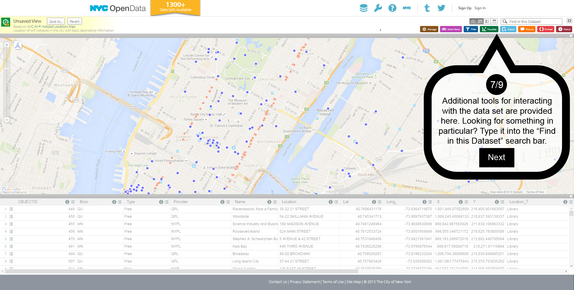
Upon selecting one of these introductory data sets, a tour of the interface would then be initiated. This tour would introduce users to the interface’s layout and tools (tour point mock-ups are included below).

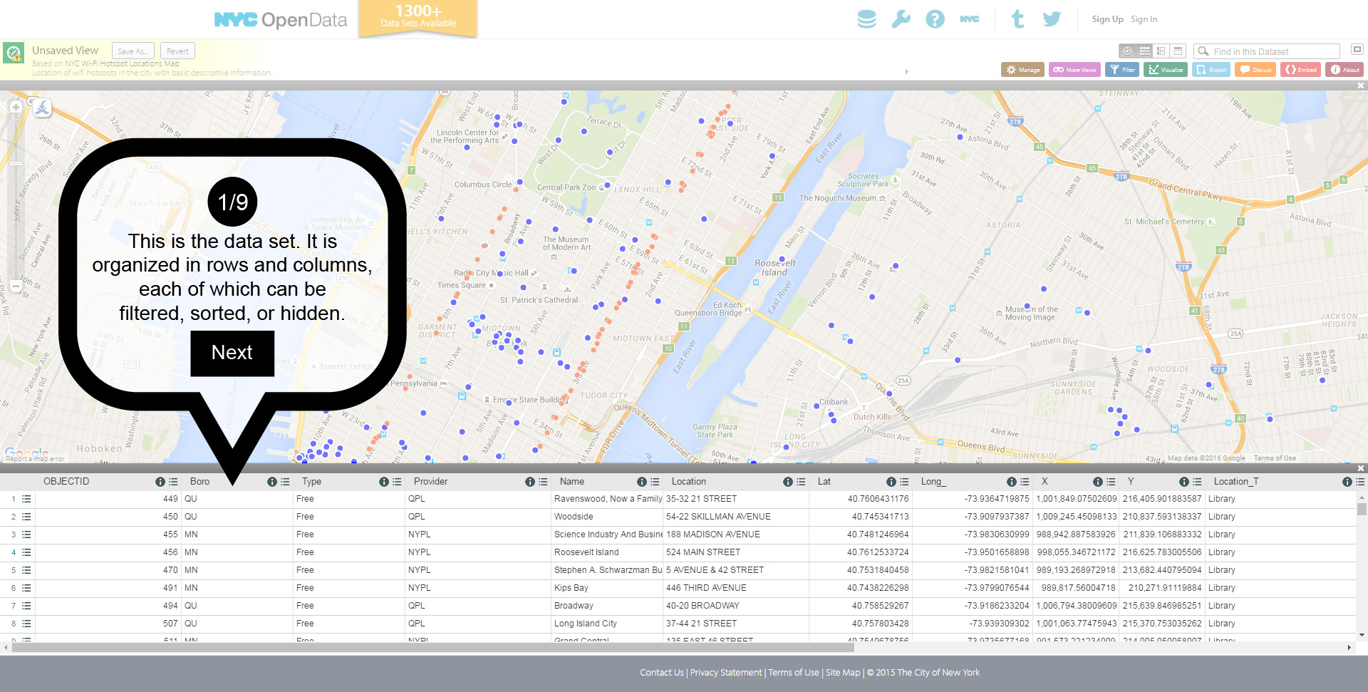
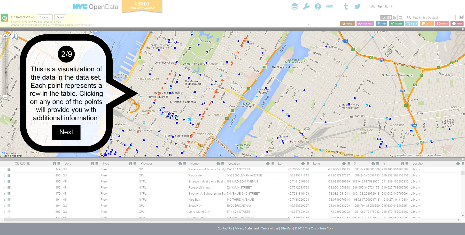
Upon completion of the tour, users would then be able to explore the data set on their own. In doing so, they would, hopefully, become more comfortable with the interface, which would help them feel confident in exploring non-introductory data sets on their own.
Recommendation 2: Provide Textual Assistance to Users
Unfamiliarity with terminology was a barrier we frequently witnessed our users encounter. Users understood that they needed to create a graph, for example, but did not understand that they must click the “visualize” button in order to do so.
Providing users with textual assistance (in the form of labeling, prompts, feedback, etc.) would improve the usability of the NYC OpenData website for users with average technical skills, who may not be familiar with data analysis and its accompanying visualization tools. Adding a mouse-over prompt to the tools displayed in the upper-right corner of the data set window is one way this recommendation could be manifested (Fig. 3).
Providing the names of available data sets as users type terms into the search bar on the homepage would be another manifestation of this recommendation (Fig. 4). This type of instantaneous textual feedback would greatly simplify the process of finding desired data sets.
Recommendation 3: Expand Data-Set Categorization
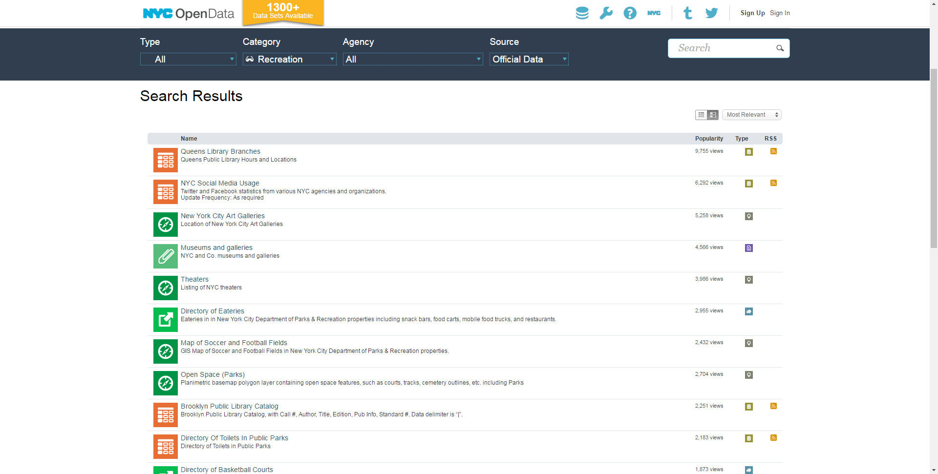
NYC OpenData’s collection of data sets can feel overwhelming and many of the users in our study expressed this. We learned that users with average technical skills have difficulty finding desirable data sets when they are presented with the complete list of data sets for a particular category (e.g., education, recreation, etc.).
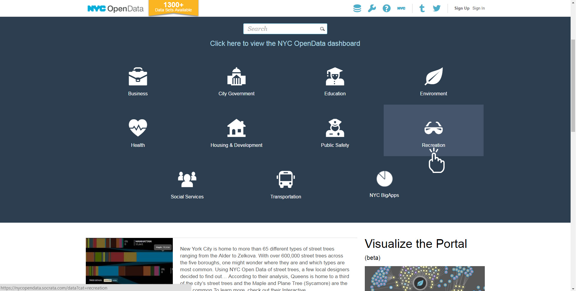
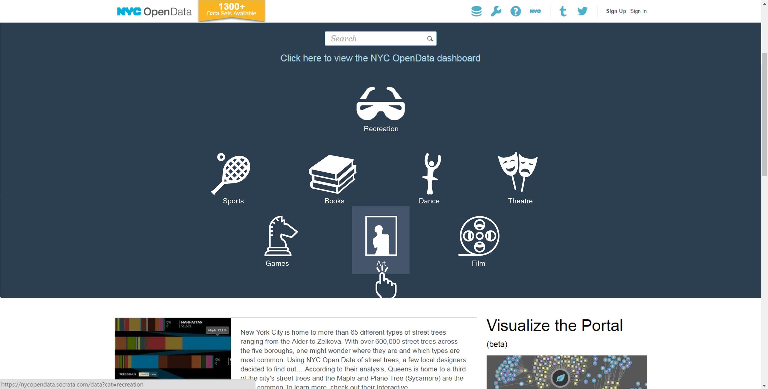
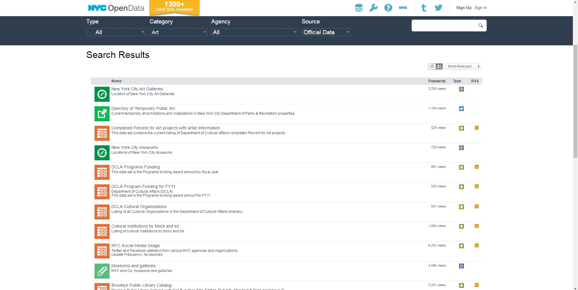
For example, clicking the recreation category on the website’s homepage, returns a list of all the data sets that are categorized as recreation (seventy-four in total). These recreation data sets include information on Queens Library branch hours and locations, the locations of NYC art galleries, and a directory of toilets in public parks (this sequence is reproduced below).

By providing users with sub-levels of categorization and allowing users to select from these categories before presenting applicable data sets, NYC OpenData would simultaneously reduce the amount of data sets returned to the user and ensure that the data sets presented are actually of interest. Selecting the recreation category on the website’s homepage, rather than returning all data sets categorized as recreation, would display a number of secondary categories that the user could select from before the complete list of data sets was returned. If the user then were to select the art category, only art data sets would be returned (this sequence is reproduced below).
Recommendation 4: Improve Visibility of “Find in this Data Set” Search Bar
Our users frequently navigated away from data sets that contained information they were looking for because after completing a ctrl+f browser search, which returned no results, they felt they were looking in the wrong data set. The ctrl+f browser search was producing false negatives because it is only capable of searching for data that is loaded within the browser window at the time of the search. Because of the quantity of data in these data sets, not all data is loaded at once, so much of it is not discoverable via this type of search.
Searching using the “Find in this Data Set” search bar would search the entire data set and return the desired information, but it was not utilized by our users. We feel this search bar wasn’t utilized because it was simply overlooked, likely because of the search bar’s visual treatment and placement, which is similar to, and becomes lost among, adjacent low contrast icons, particularly in the default data set view (Fig. 5).
Even at 175% zoom, however, the search bar still blends in with adjacent icons (Fig. 6).
By reorganizing adjacent icons so that the search bar could be placed in the leftmost position, increasing its size, and adding a high-contrast color consistent with the icons below it, the search bar would be much more visible and more frequently utilized (Fig. 7).

At the conclusion of the study, we presented our findings to Mr. Sedillo of MODA (Fig. 8). Of particular interest to Mr. Sedillo was the makeup of our user test participant pool. As mentioned previously, MODA was interested in ensuring that users with average, as opposed to advanced, technical skills could easily interact with the website and its data sets. We were able to assure Mr. Sedillo that our user test participants were in fact users with average technical skills by providing him with our pre-test questionnaires, which documented the participants’ comfort levels with regard to technology.
Mr. Sedillo was pleased with our findings and thought our recommendations would go a long way towards making the website more accessible to users with average technical skills. He expressed concern, however, that some of our recommendations would be more complicated and expensive to implement than others. In response, we discussed which of our recommendations would have the best “cost to value” ratio for MODA. At the top of our list was the recommendation that the website display attractive introductory data sets prominently on its homepage. This could easily be implemented and would benefit users with average technical skills a great deal. As evidence, we cited the fact that all of our user test participants were significantly more successful at navigating data sets of their choosing, as opposed to data sets assigned to them. We observed that when participants were interested in a data set, they were much more invested in learning how to navigate it successfully. We felt confident that if actual users were provided an opportunity to access a data set of interest to them, they would be similarly invested, and ultimately successful, in learning how to navigate data sets on the website successfully.

Fig. 8: Presenting one of our recommendations to Mr. Sedillo of MODA.

A short period of time after our presentation to Mr. Sedillo, NYC OpenData’s website had begun to feature a data set on its homepage that we felt would be of interest to many New Yorkers: a data set about taxi cab use in New York City (Fig. 9), and at the beginning of the following year, the website was given a complete redesign (Fig. 10).
This website redesign incorporated two more of our recommendations: a search bar with dynamic feedback (Fig. 11) and a “How To” page with step-by-step instructions and numerated tour points (Fig. 12).
With the goal of understanding how the implementation of our recommendations may have affected the usability of the redesigned website, we performed a new round of in-person, moderated user tests. In order to limit the number of variables between the pre- and post-redesign tests, we used the same participant consent forms, moderator scripts, and post-test questionnaires. We did not use the same participants, however, as we didn’t want any familiarity with the pre-redesigned website to affect the results of this new round of testing. We also asked the participants to read through the “How To” page before completing their targeted tasks. We discovered that all four participants had a greater degree of success navigating the website and its data sets, particularly with regard to the data sets that were assigned to them. Obviously, a website redesign of this scale incorporated a number of changes that were beyond the scope of our user study, but we were pleased, nonetheless, to have had a part in making this unique and valuable website more accessible to MODA’s target user group.